An interview with Stacy Gordine – designer of the new font and tumu (head) of Te Takapū o Rotowhio (National Stone and Bone carving school)
When did this project begin? The idea came about around mid-2024, during the early stages of setting up the NZMACI Foundation. We were working with Anzac Tasker from a creative agency called Guardians, and they suggested we create a unique font—one that reflected the essence of our wānanga and the future vision and purpose of NZMACI.
How did you go about developing the font? The creative journey began with a lot of experimentation—playing around with different concepts, features, and motifs. Like all māori art, the design was deeply rooted in te taiao (natural environment) and guided by a sense of connection to our history, our present, and where we’re heading.
I led the initial concept work, exploring different ideas. Eventually, the final design became a blend of a few key concepts. The designer, Hos, then translated those into a visual language that worked in the design space.
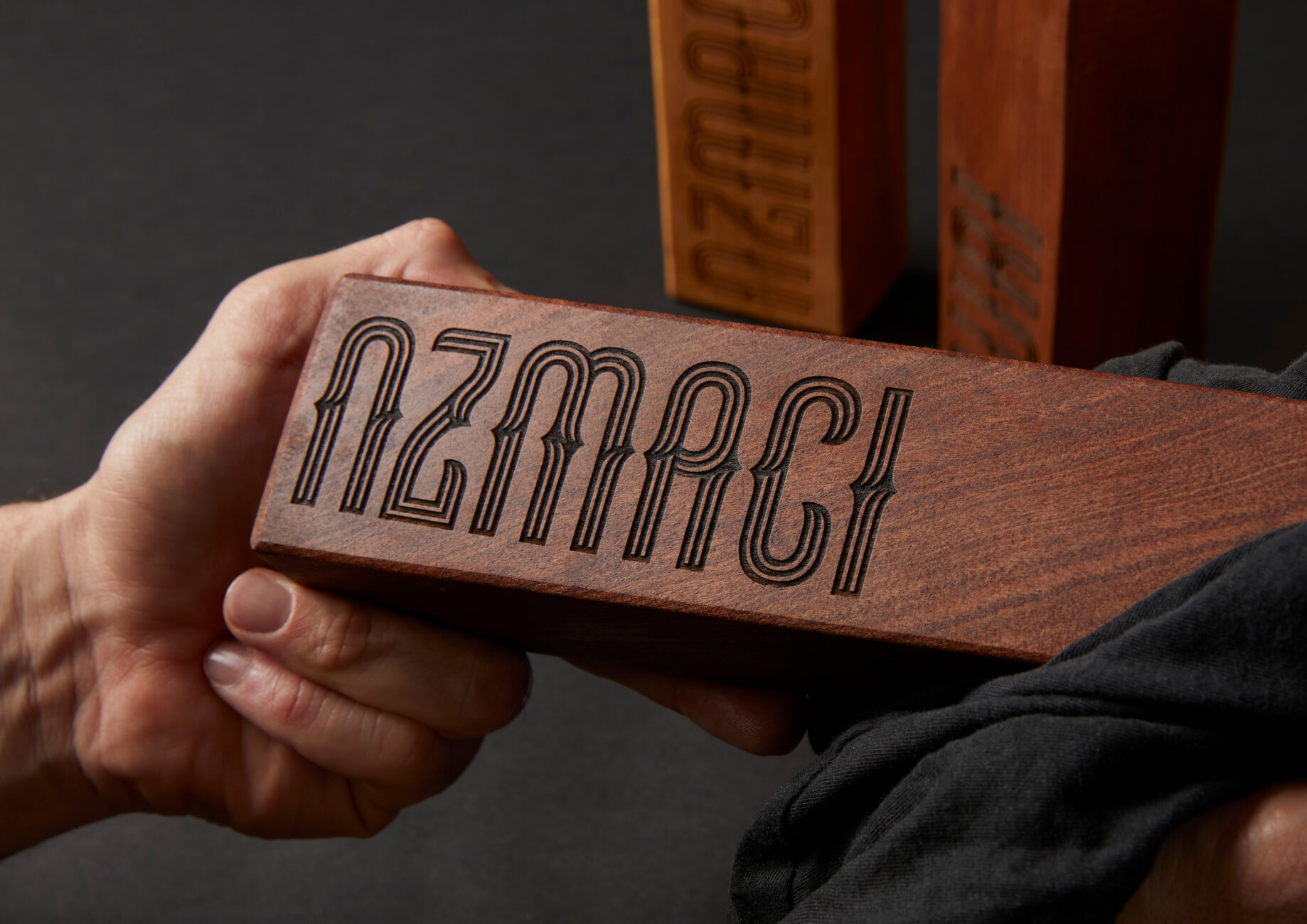
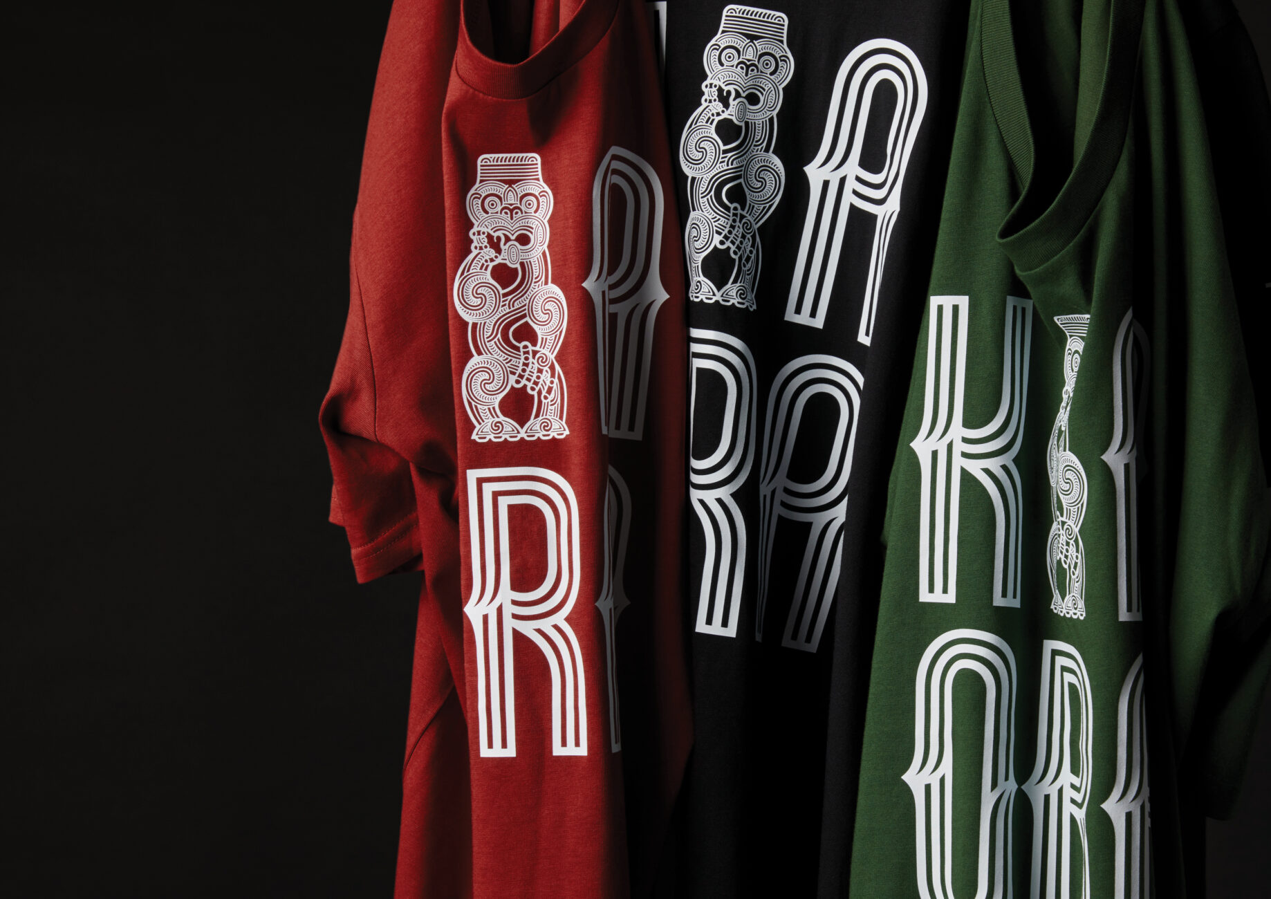
Hae Whakarewa font engraved on mallet
What does the final design represent? The typeface (font) is rich with meaning and kōrero. It reflects several layers of whakaaro (thinking):
· The three lines in the design are inspired by takitoru, a common Māori element, representing ngā kete tuku iho—kete aronui, tuauri, and tuatea.
· They also represent the three wānanga: Te Wānanga Whakairo Rākau, Te Rito o Rotowhio, and Te Takapū o Rotowhio.
· And finally, they speak to the three-way relationship between mana whenua, Te Puia, and NZMACI.
· The central line that stands out running horizontally through the middle (of the font) symbolises te pae tawhiti—our long-term vision that we’re striving to draw nearer. It also evokes cresting waves, tying into our role as the pōito (buoy), supporting and uplifting Māori arts, crafts, and culture.
· The elongated shapes in the design take inspiration from the waharoa at the entrance of Te Puia | NZMACI. The haehae pattern is intentionally designed to catch the eye—to create movement, spark curiosity, bemuse and make people pause and reflect.
· There’s also a subtle play between positive and negative space. The negative spaces between the individual letters of the font represent the pou — those who came before us and left their mark, whose legacy we now carry forward.
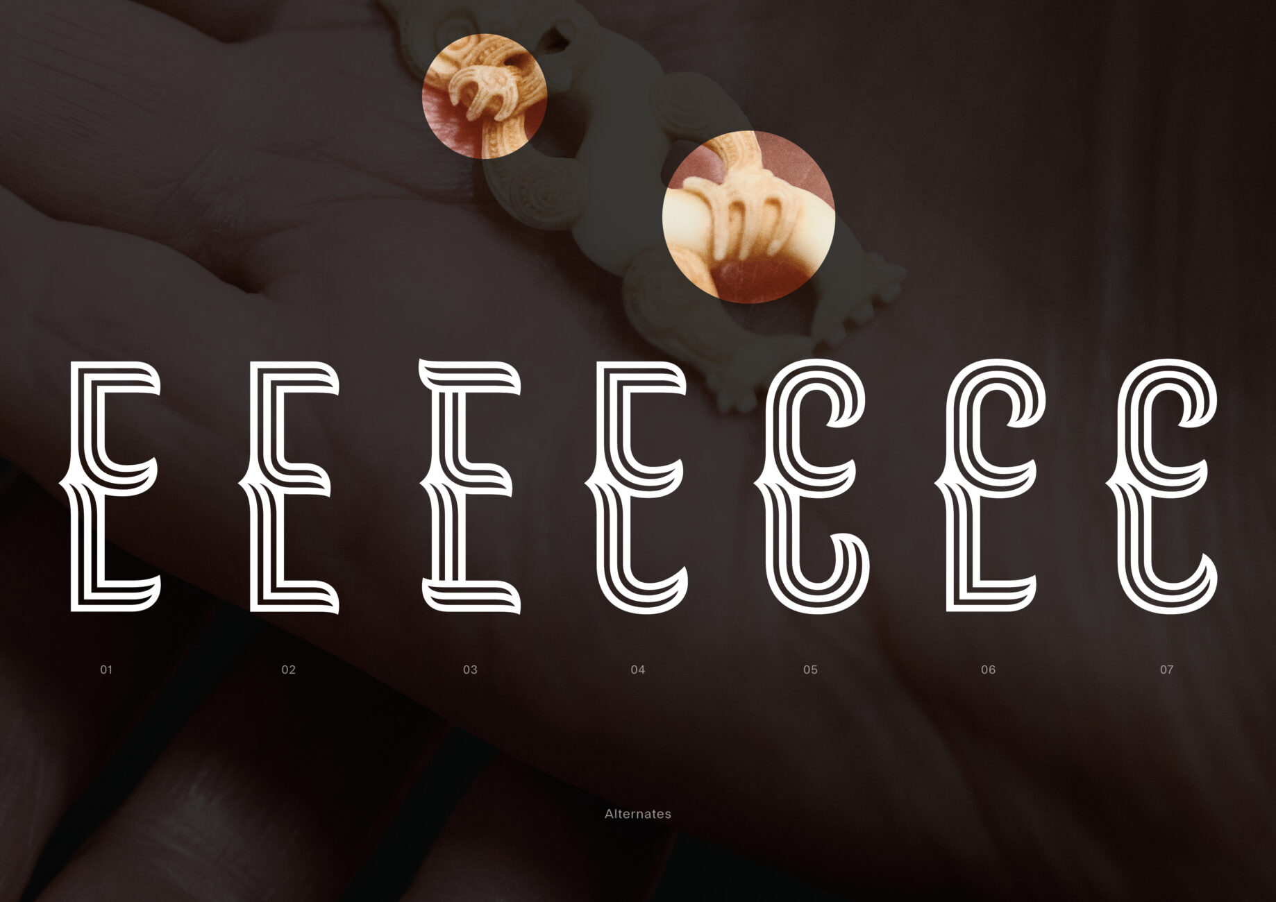
Inspiration for font design
All of the design elements are grounded in traditional Māori art forms—seen in carvings and pendants.
What does it feel like to see the font finished and being worn by everyone? It feels mean! Like every kaupapa/project, it was challenging but approaching it with an open mind made the process enjoyable. I loved the collaboration aspect of drawing on different strengths to achieve the final goal. Everyone involved should feel proud. Wearing the t-shirt isn’t just about a cool design—it’s about standing for something, being part of uplifting and celebrating Māori arts, crafts, and culture.
Stacy Gordine tumu (head of school) for Te Takapū o Rotowhio (National Stone and Bone Carving School)
Stacy Gordine
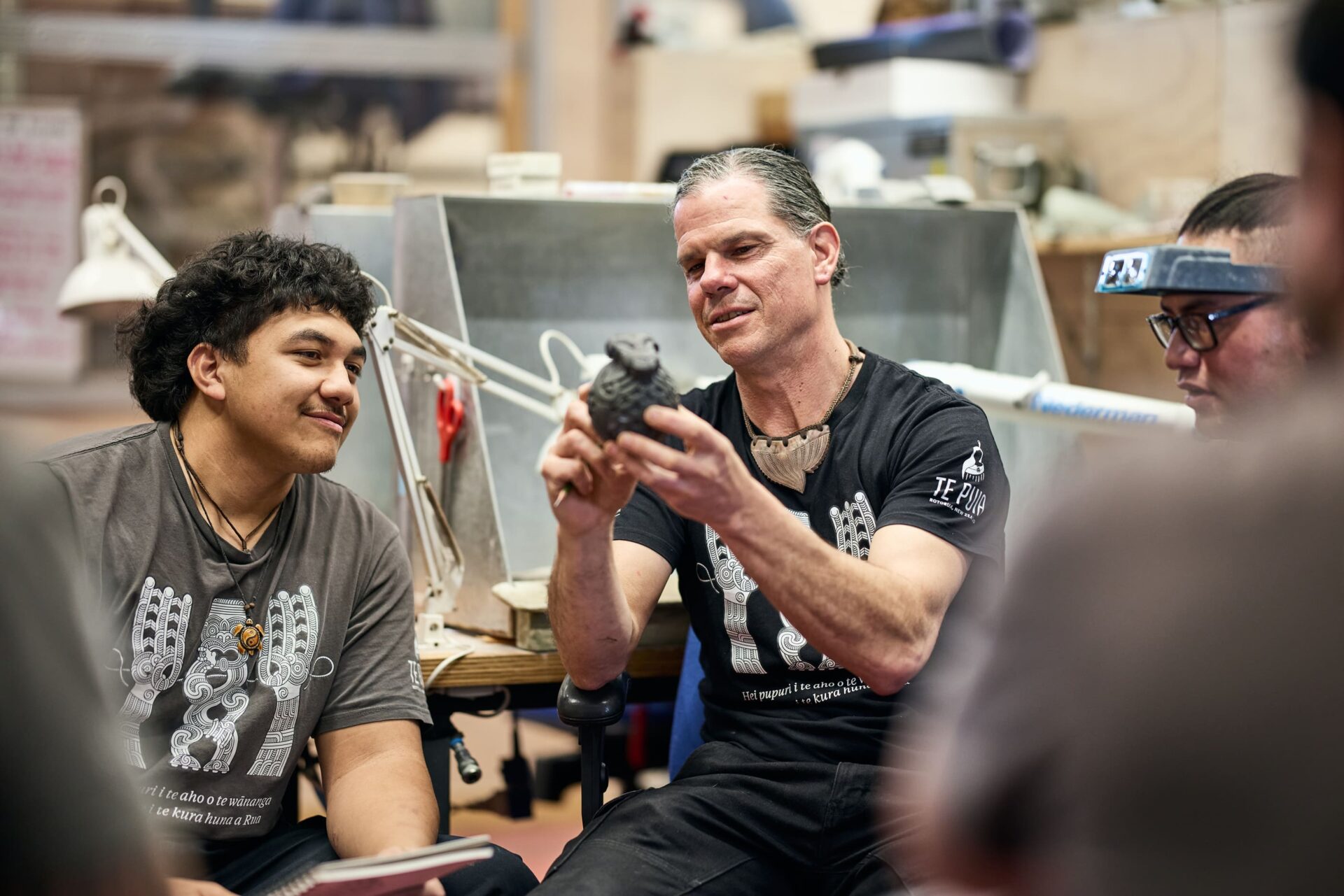
Internationally acclaimed for his small-scale adornment works, Stacy Gordine is the tumu (head of school) for Te Takapū o Rotowhio (National Stone and Bone Carving School) at the New Zealand Māori Arts and Crafts Institute (‘NZMACI’).
With over 25 years’ experience as a multimedia carver and adornment artist, Stacy has carved alongside the indigenous peoples of both Alaska and Hawai’i, serving not only as tutor but also as student as he practiced his craft alongside the indigenous master artists.
Arriving to NZMACI in 2013, Stacy continues the legacy of his great-uncles’ Pineamine and Hone Te Kauru Taiapa, who were students of the original carving school in Rotorua in 1927 and tutored many of today’s master carvers.
Other works Stacy has led include Tū Awhionuku the Hemo Gorge sculpture that was built using world-leading 3D printing technology.